UX Design for HALO OUTPOST DISCOVERY APP
UI Design
Meta-interactive experience
Halo: Outpost Discovery is a meta-interactive experience. Attendees could experience several physical events, including The Ring Experience, Trying Grounds, Pelican Training, UNSC KIOSK, and more. Attendees could also interact with these events from the comfort of their pockets. We designed this app to allow Halo fans to interact with the Halo universe in several unique ways. This was their digital companion; it was a way that allowed users to interact with these physical events that only a companion app can.
The experience toured several locations in North America through the summer of 2019.
When opening the app for the first time, Gabriella guides users through the First Time User Experience. With the scanner function, participants can scan physical tickets with their phones, guide them to new locations and unlock additional content using augmented reality (AR). They can check their progression, challenges, leaderboards, event schedule, and floor maps.

Problems and Solutions
The Product Problems:
Our design team at 343 Industries acquired an imperfect design from a third party. Our team needed to deliver a working application with complete UX and UI solutions, including 3D assets, AR solutions, and animations, within a 3-month time frame.
The third-party would handle all coding and development for the app. Our design team needed to meet with their team semi-weekly to communicate and present ideas. These designs needed to work within the technical limitations their development team had before we worked on the app.
The Product Solutions:
Our product is a central device that allows you to interact with physical events from the convenience of your pocket.
The user can experience the app both signed in and signed out
The user can scan their physical ticket and use their phone to scan a bar code to check into events
The user can quickly check their progression and challenges from the home screen
The user can check events, select what venue they are attending, and look at the event schedule
The user would get notifications presented in the form of animated toasts
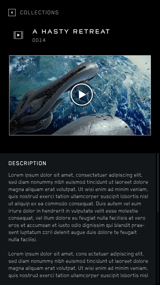
The user would have a place to view their collections in the form of 3D assets and videos
The UX Design Process
Understanding the user
We needed to conduct research to understand the needs, goals, and behaviors of the target user group.
We spoke with the third-party that had started some initial work and 343 Industries stakeholders. We determined that the users are primarily expert users with a large knowledge of the HALO Universe and lore. We knew families would be attending these city-wide events as well so we needed to make the app easy and fun to use.
Most of our target user group has experience with gamification, progression, and collecting game achievements and rewards.
Design tools I used
I was the UX designer (a few UI screens, i.e. scanner) using Sketch, Illustrator, and Photoshop.
Information Architecture & Screen Flows
The first item I needed to design was the Information Architecture document. I needed to think about the app's main features and how the user would use them on the event floor. The user was required to sign up to track their progress, but we wanted to allow the user to understand the app without signing up for an account. Physical badges were provided to attendees to gain access to show floor events. The app would provide a way to scan the user's badge to replace the cumbersome physical badge and lanyard to attend events.
The user needed to be able to choose what location they were at and access the floor map of the event they were attending. Once signed in, the user could track their progression, check the event schedule, scan KIOSKs, see active events, and interact with challenges and leaderboards.
The app provided notifications where users could see the XP they gained from challenges, digital medals, and physical rewards they earned. Notifications would come in the form of in-app reminders and animated toasts to help motivate the participants to 100% completion.
It was my job to design a pleasant experience that worked in a seamless and fun companion app to the physical events in different cities.
End of FTUE
Signed Out
How the User Signs In
Once the User has Signed In
Wireframe designs
Although each design product and the process can differ slightly, I usually start designing wireframes after the Information Architecture stage. This helps me drill down on individual screens and direct how each screen will function down to small details. This helps me become the product expert and lets the team start seeing how everything works together.
Wireframe for video not playing in Collections
UI for video not playing in Collections
Wireframe for Leaderboards
UI for Leaderboards
Testing
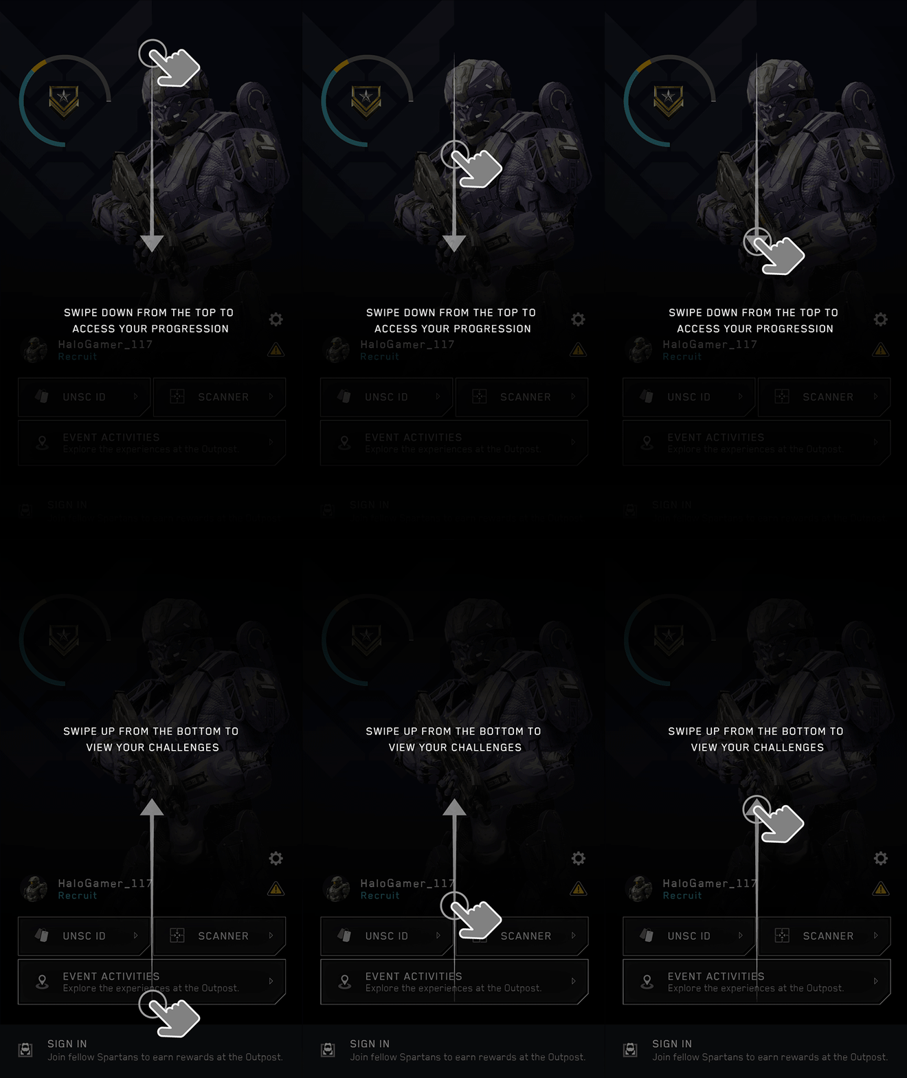
I made a few prototypes in Figma and Protopie for this project. We tested these internally and also presented design ideas to stakeholders. The most challenging screens to prove worked were swiping up on the home screen to reveal Challenges and swiping down to reveal Progression.
Design Validation
We were not showing the active challenge in the first version of the prototypes. Initially, we had a text string informing the user to swipe up to see challenges whether they had a challenge active or not. I quickly determined we should be showing the active challenge if they have one.
We then decided we would have an animated tutorial. After some discussion in meeting rooms and dry-erase board sessions, we devised a solution for how this would work. Here is the UI that came out of those learnings designed by the UI team.
UI created by the Design team
High-Level Feature Breakdown
I've included several wireframes that I designed. These are examples of the more demanding features. I have also included examples of the final UI created by the design team. These wireframes helped drive the features' functionality and helped direct the UI team to make well-informed design decisions.
First Time User Experience
Starting from screen 1, the FTUE explained the app in 5 easy steps.
Wireframes for the FTUE
Sign Up
After the FTUE the user can scan their physical badge and forgo the XBOX Account sign-in process. Or, they can sign up using their XBOX account and experience the full digital experience.
Wires for Sign Up
UI for Sign Up
Challenges and Medals
This screen allows users to track their challenges and earn medals for completing them.
Wireframes for Challenges
UI for Challenges
Maps
This screen is where the user can interact with the physical layout of the experience. Users could access information about vendors, claim physical and digital rewards, and FAQs.
Wireframe for Maps
UI for Maps
Conclusion
In conclusion, designing a successful mobile application involves understanding the needs and wants of your target audience, creating a user-friendly interface and navigation, and implementing features that add value to the user's experience.
With this digital application, I designed multiple features using new technology like AR where vendors and fans could come together to experience a virtual scavenger hunt. This was truly an epic event!


